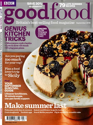
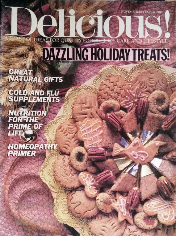
My cover started off differently that i had originally imagined. I started out with more extravagant and bold ideas for colors all over the cover. But when i first added the first picture, i realized that the brown and green color made me shift more to a simpler design. Keeping the pho on the right and the text on the left shifted to the more simple aesthetic. In both article pages, the use of simple geometry is also used to remove empty space from the pages without the need of any extra text or fancy graphics.
The page layout reflects this style as well. Text tends to be on the left of the page with the only exception being the ingredients list. Especially if someone is trying to learn to cook a new dish, keeping the information accessible and easy to read is first and foremost of any article. I used pictures of two different types of Pho. Those being a Saigon-style beef pho and a spicy chicken pho.
Why did i chose pho? Well i enjoy it. I like cooking in general and i am a fan of noodles. Since theres a really good Vietnamese place downtown so i figured that doing a food magazine was always a good reason to go back to it.