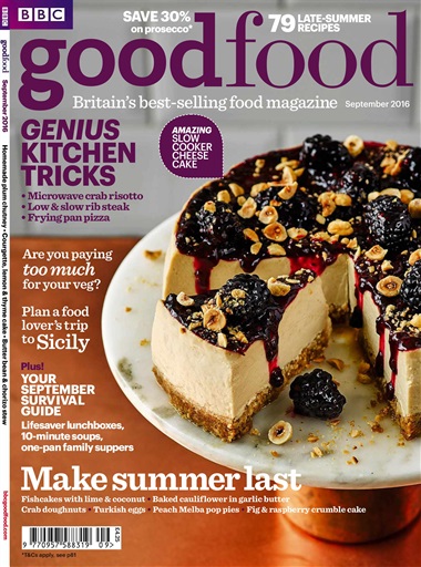
What did i do to make this and why each font and size, page number: The title font i used was Rockwell in size 48. The reason i chose this font was because its very bold and distinctive For the smaller slogan i went with Abril Fatface in 24 size font. This is because Abril makes the words a bit longer for easier reading. The headlines where a 22 size Abril. While the main part of the picture would take up the left section the sides of it would spill into the bottom right corner to keep coloration stable throughout the entire cover. Title cover is variable but as it seems consistent with other magazines, the title should be a darker version of the most noticeable color.
Template:
Inspiration


No comments:
Post a Comment